Audience members take a closer look at Gor Jihanian’s Armenian take on the Type Thursday font (photo Gabriel Ouzounian)

Fonts for Days: Introducing Type Thursday Yerevan

778
0

By Roza Melkumyan

Special to the Mirror-Spectator

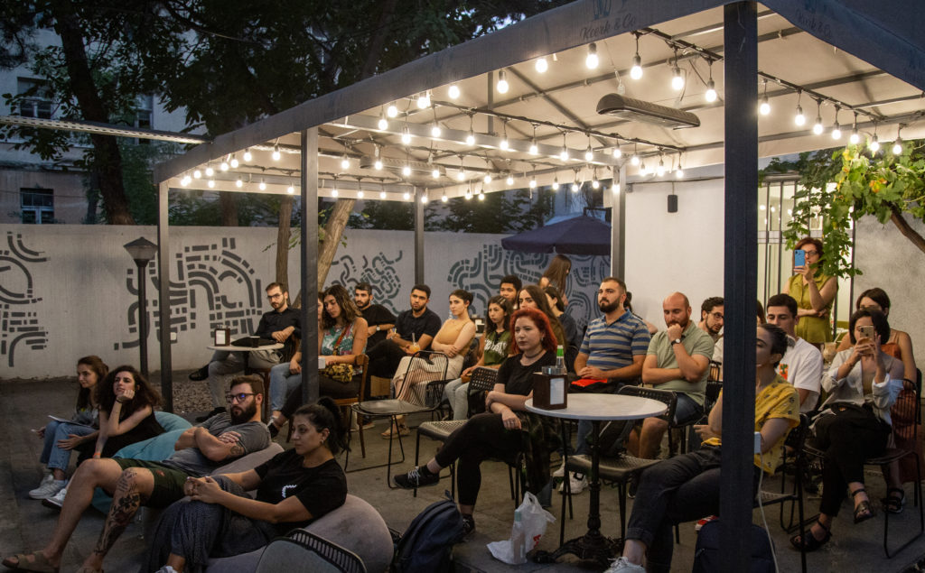
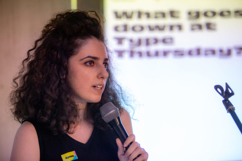
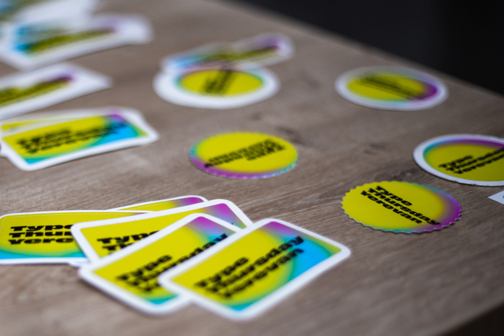
YEREVAN — On the evening of Thursday, September 2, typography enthusiasts and newcomers to the artform alike gathered in the courtyard of Keerk & Co cafe for Yerevan’s very first Type Thursday event.

The courtyard at Keerk & Co is packed for Type Thursday Yerevan’s first event (photo Gabriel Ouzounian)

For those who don’t know (and I definitely didn’t know), Type Thursday is a monthly meeting for people who love letterforms, graphic forms of letters that are either written or rendered in a particular type font. Letterforms can be found just about everywhere, from the dropdown list of fonts in your Microsoft Word toolbar to nametags to storefront signs to the words and letters that make up a product’s branding.

Gor Jihanian presents his Armenian take on the signature Type Thursday font (photo Gabriel Ouzounian)

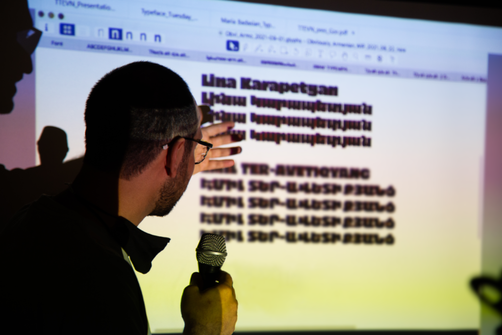
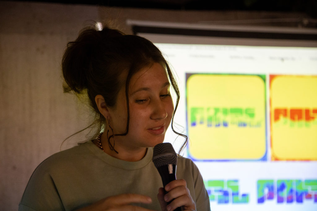
The typical Type Thursday begins and ends with social time and drinks for members of the community. But the real fun starts with an hour of Type Crit, a moderated group critique of up to three projects-in-progress that involve letterform design. As an attendee, you are encouraged to ask questions and give constructive feedback, but you are also welcome to simply sit back and listen. Often, the discussion is moderated by a Type Thursday dialogue lead who has extensive experience in letterform creation and usage.

Participants are encouraged to submit any and all things typographic to the discussion that might benefit from the feedback of type designers and educators. You could present sketches of some lettering you came up with, type used in advertising or posters, or typeface – a group of characters, letters, and numbers that share the same design, such as the Times typeface family, which includes the Times New Roman font.

Get the Mirror in your inbox:

With chapters already established in 13 other locations, including major cities such as New York City, Madrid, London, and Los Angeles, Type Thursday is an international organization that aims to foster and facilitate communities all over the world that hold design at the forefront of their thought.

The idea to establish a chapter in Yerevan came from graphic designer and Birthright Armenia alumna Maria Badasian, who had already attended many Type Thursday events in her native New York City and was struck by the warmth and support she had found in its design community.

Maria Badasian presents her “tuyn” graphic at Type Thursday Yerevan’s first event (photo Gabriel Ouzounian)

According to Maria, “the only rule really is to have letters in your design.” The sky’s the limit in terms of what you can present, and there’s room for both fun and serious critique. “It’s an opportunity to push design thinking, and I think that’s something that’s missing in a lot of places, including Armenia. When I asked designers here if there was a design community, they all said no.” She envisioned a Type Thursday Yerevan that would provide the space necessary to foster and grow that design community while elevating it.

In order to make her idea a reality, Badasian teamed up with graphic designer Araz Bogharian, who was instrumental in establishing Yerevan’s Type Thursday chapter and organizing its first event. She will continue to act as the chapter’s lead for all events to come. For their first event, they also enlisted the help of independent graphic designer Gor Jihanian. Having completed an MA in Typeface Design at the University of Reading and having dedicated his life to researching and developing Armenian typefaces, Jihanian seemed the perfect person to serve as the inaugural event’s dialogue lead.

Araz Bogharian kicks off the event (photo Gabriel Ouzounian)

The event featured three presenters, Badasian, Jihanian, and recent college graduate and graphic designer Emil Ter-Avetikiants. In his presentation, Ter-Avetikiants presented a font he was developing to be applied to both the Latin and Armenian alphabets. He drew inspiration from Mesrop Mashtots, the inventor of the Armenian alphabet, as well as from the various inscriptions found on Yerevan’s many sculptural monuments and in Armenia’s khachkars (cross-stones).

As someone new to the type scene, I learned just how much work goes into creating a font. One must not only look at the way a design is applied to individual letters, but to the way those letters in said design work together as words and sentences. Applying that same design to two very different alphabets has its own unique challenges, as spacing works differently in the Armenian alphabet, which we discussed later on in the evening.

New to the Armenian alphabet and language herself, Badasian presented a piece she had been working on involving the Armenian word “tuyn” (թույն), which means “poison” and, more colloquially, “cool.” She shared images of her beginning sketches, and described her process in designing the graphic, revealing the final piece’s neon yellow, orange, and salmon color scheme to be loosely inspired by colors of poison in history.

Emil Ter-Avetikiants explains the inspiration for his Armenian font (photo Gabriel Ouzounian)

During her feedback session, one participant asked if she had considered making a font out of her “tuyn” graphic. Here again we were reminded of the challenge that lies in creating fonts — you are tasked with solving a puzzle, coming up with a system in which every letter fits together no matter what you write.

Badasian’s “tuyn” graphic served as a great example of how creating type with the letters of the Armenian alphabet presents its own unique set of challenges while highlighting the ever-changing nature of letterforms. The Armenian letter “թ” is typically written or rendered larger and taller than most other letters. In recent years, however, the letter has experienced a shift of sorts as fonts and letterforms opt for a smaller, more Latinized “թ” that fits more easily with the other letters. According to Jihanian, who had lots to say during Badasian’s presentation, this tendency to Latinize letters was becoming a trend.

During Jihanian’s presentation, the audience was able to recognize the painstaking work that goes into creating a cohesive type font. Each Type Thursday chapter, apart from their unifying mission, utilizes the same signature font (which you’ll notice on the stickers photographed above). Having dedicated his life to type with Armenian letters, it seemed only fitting that Jihanian create the Armenian version of this signature font.

This isn’t Jihanian’s first time working with Armenian fonts. He is credited with helping to revamp TypeTogether’s Adelle Sans Armenian font, which “provides a clean and spirited take on the traditional grotesque sans for Armenian audiences.” During his presentation, Jihanian expressed that often, it’s too easy to default to Latin fonts and typefaces because there simply aren’t enough Armenian fonts in existence. For this reason, he continues to focus his efforts on revitalizing the Armenian language both in Armenia and for the global Diaspora community.

As a member of the diaspora who had never interacted with her father’s native language, I moved to Armenia with a mission to learn the Armenian language and alphabet. I recognized this skill as a step towards preserving my heritage while being offered the opportunity to interact more deeply with my culture. Though it no longer intimidates me like it once did, the Armenian alphabet remains as beautiful as ever to me. Falling in love with this alphabet has begotten a deeper love for its language, and thus its — my — culture.

In creating a space for the Armenian design community, Type Thursday Yerevan not only elevates that community, it elevates the Armenian language and culture while encouraging design-oriented thought. The event sets parameters for typography that are at once clear and flexible, facilitating a creative and thoughtful consciousness in regards to the artform.

What I love most, though, is its accessibility, especially to those of us who aren’t graphic designers or typographers. After all, in most cases it will be the regular person who will interact with these designs in the real world, whether it be using a particular font to type something, buying a product based on the appearance of its branding, or simply reading a sign on the street.

Free stickers reading “Type Thursday Yerevan” are offered at the event (photo Gabriel Ouzounian)

Yerevan may be a small city, but it’s got lots of talent in many mediums. So why is that we mostly hear about growth and innovation in areas like the tech industry? As successful companies like PicsArt bring Armenia into global consciousness and organizations like ONEArmenia and HIKEArmenia create platforms for experiential tourism and the country’s burgeoning hiking culture, so too should design have its place. Here is an opportunity to grow and elevate Armenia’s design community while encouraging economic growth for the country. With all the challenges that Armenia has faced and continues to face, we must continue to build its economy.

With its seed money used up and its first event a success, Type Thursday Yerevan is faced with a new challenge – finding funding. The chapter is currently looking for a space to sponsor its monthly events as well as potential partners in food and drink. If they can secure this, Type Thursday Yerevan will not only survive, but thrive. The next Type Thursday Yerevan event will be October 7 at 8 p.m. Here’s hoping there will be many more events to come!


Get the Mirror-Spectator Weekly in your inbox: