“The striped letter is not entirely a letter, it is rather something that lies between writing and music.”
― Abdelkebir Khatibi, The Wounded Arabic Name
“Calligraphy is a kind of music not for the ears, but for the eyes.” ― V. Lazursky
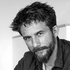
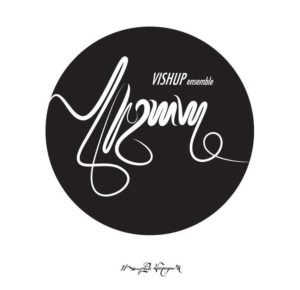
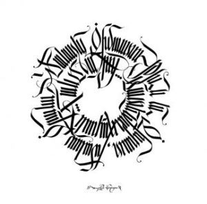
Over the centuries, calligraphy has variously been described as music for the eyes or visual poetry. Great calligraphers such as Su Tung-p’o (11th century), John Van de Velde the Elder (17th century), or more recently 20th century practitioners such as Rosanjin in Japan or Peter Bailey in the United States have all produced work as striking as that of our finest artists, though their names are less well-known than Michelangelo, Picasso or Rothko. Born in 1971, Ruben Malayan continues in this fine calligraphic tradition, creating works at once powerful for their artistic value as well as noteworthy for the renaissance that he is helping to engender in Armenian writing and printing.
Malayan graduated from the Art Institute in Yerevan and then travelled to Israel where he worked in advertising, as well as the Netherlands and Montreal before returning to Armenia in 2011. As an artist Malayan understands that when all is said and done, culture is the only thing that sustains individuals as well as nations. And he considers Armenia to be in a state of cultural as well as political crisis. Since the fall of the Soviet Union, he and others have bemoaned the relative fall in educational standards and the poor knowledge that many students within Armenia possess of their own history — hence in part the decision some have made to emigrate.

Linguistic differences between Western and Eastern Armenian apart, until recently anyone who tried to read a book printed in Armenia would often come up against letters and paragraphs difficult to make out. Says Malayan: “Armenian typography was so terrible because the only standardized efforts had been made in Mkhitarist Venice (centuries ago). Every community since has done as it has seen fit. There was no universal typography for the Armenian alphabet. The Soviet legacy in typography was a mixed bag that went out the window with independence. Afrikyan was an exception, but the educational system failed typographers by not picking up these new letterings and disseminating them.” Some may choose to disagree, but the old adage that one shouldn’t judge a book by its cover only goes so far — the attractiveness of both graphic design and lettering obviously makes a difference when reading, which is after all a sensual as well as an intellectual experience. And the more knowledgeable about history and culture a calligrapher is, the more this becomes reflected in his work as well: “Every work I create is a chance to revive ancient forms and give them a modern appeal…” notes Malayan. “Ironically, the work which is created on paper and which is unique, ends up shown on a computer screen. A digital copy never has the same appeal as the original work on paper.”


